Speed Up Shopify Store on Mobile: 2026 Real-User Data
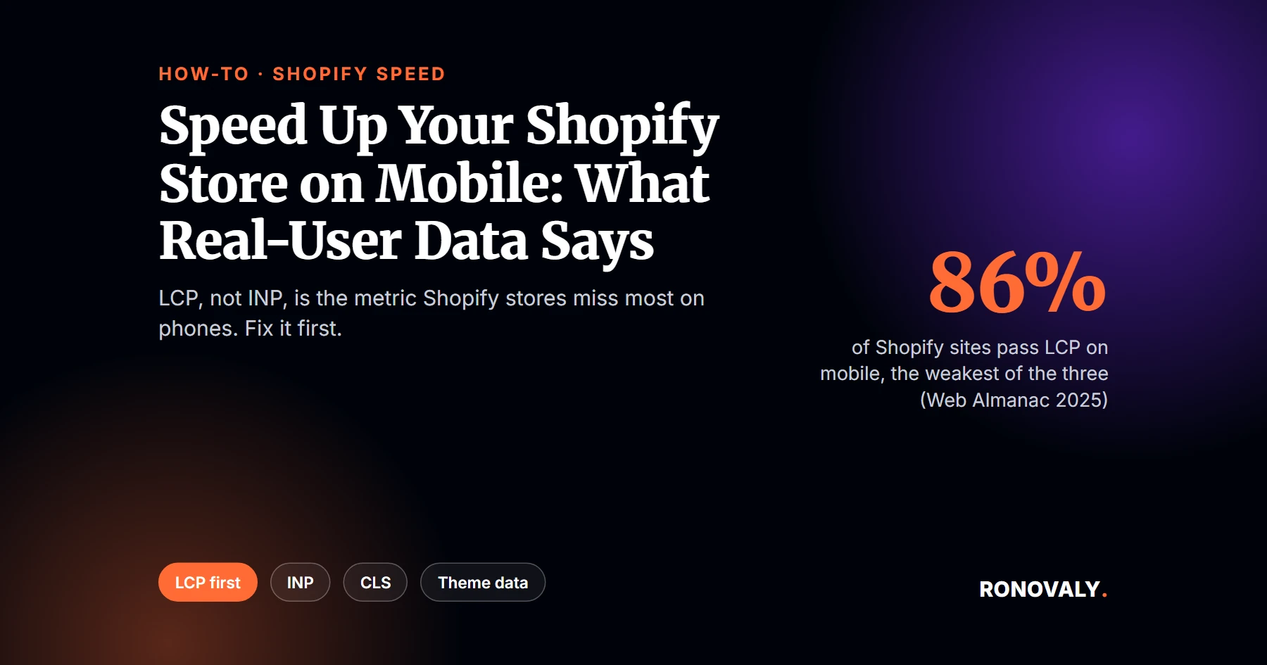
To speed up Shopify store on mobile, fix Largest Contentful Paint first. Real-user data shows it’s the metric Shopify stores miss most often on phones. According to the HTTP Archive Web Almanac 2025, 86% of Shopify sites have good LCP on mobile, against 90% for INP and 92% for layout stability. Overall, 76% pass all three Core Web Vitals. So your hero and product images deserve attention before anything else.
Core Web Vitals are Google’s three user-experience metrics: Largest Contentful Paint (LCP) for loading, Interaction to Next Paint (INP) for responsiveness, and Cumulative Layout Shift (CLS) for visual stability. Google assesses them at the 75th percentile of page loads, separately for mobile and desktop, per web.dev.
I rebuilt this guide on September 27, 2026 around real-user data rather than lab scores alone. From my research, the old advice that INP is the main mobile problem doesn’t match Shopify’s numbers. Here’s what does, and the order to fix things in.
This guide focuses on phones. For the full list of fixes that apply to desktop and mobile alike, see how to speed up your Shopify store. If your theme turns out to be the bottleneck, compare it in our ranking of the fastest Shopify themes.
Key Takeaways
- On mobile, 86% of Shopify sites pass LCP, 90% pass INP, and 92% pass CLS, per the Web Almanac 2025.
- 76% of Shopify sites pass all three Core Web Vitals on mobile, the same share as on desktop.
- Google’s “good” thresholds are LCP within 2.5 seconds, INP of 200 milliseconds or less, and CLS of 0.1 or less.
- A PageSpeed score of 90 to 100 is good, 50 to 89 needs improvement, and 0 to 49 is poor, per Lighthouse documentation.
- Fix order for most stores: LCP images first, then heavy scripts for INP, then layout stability.
What Real Mobile Data Says About Shopify Speed
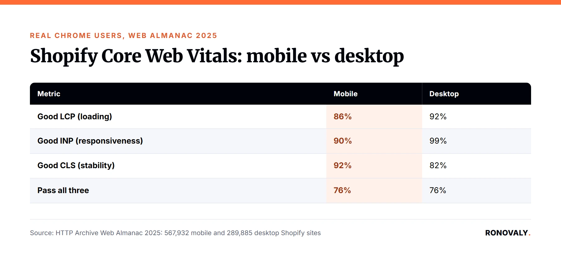
Mobile and desktop fail in different places. I found the clearest picture in the Web Almanac’s ecommerce chapter, which reports real Chrome users on Shopify sites:
| Metric | Mobile (567,932 Shopify sites) | Desktop (289,885 Shopify sites) |
|---|---|---|
| Good LCP (loading) | 86% | 92% |
| Good INP (responsiveness) | 90% | 99% |
| Good CLS (stability) | 92% | 82% |
| Pass all three | 76% | 76% |
Two things stand out. First, on mobile, LCP is the weakest of the three, so image loading is the most common problem. Second, CLS is actually worse on desktop than on mobile. In other words, a mobile speed plan should start with images and scripts, not layout.
Step 1: Check Your Real Mobile Data, Not Just the Score
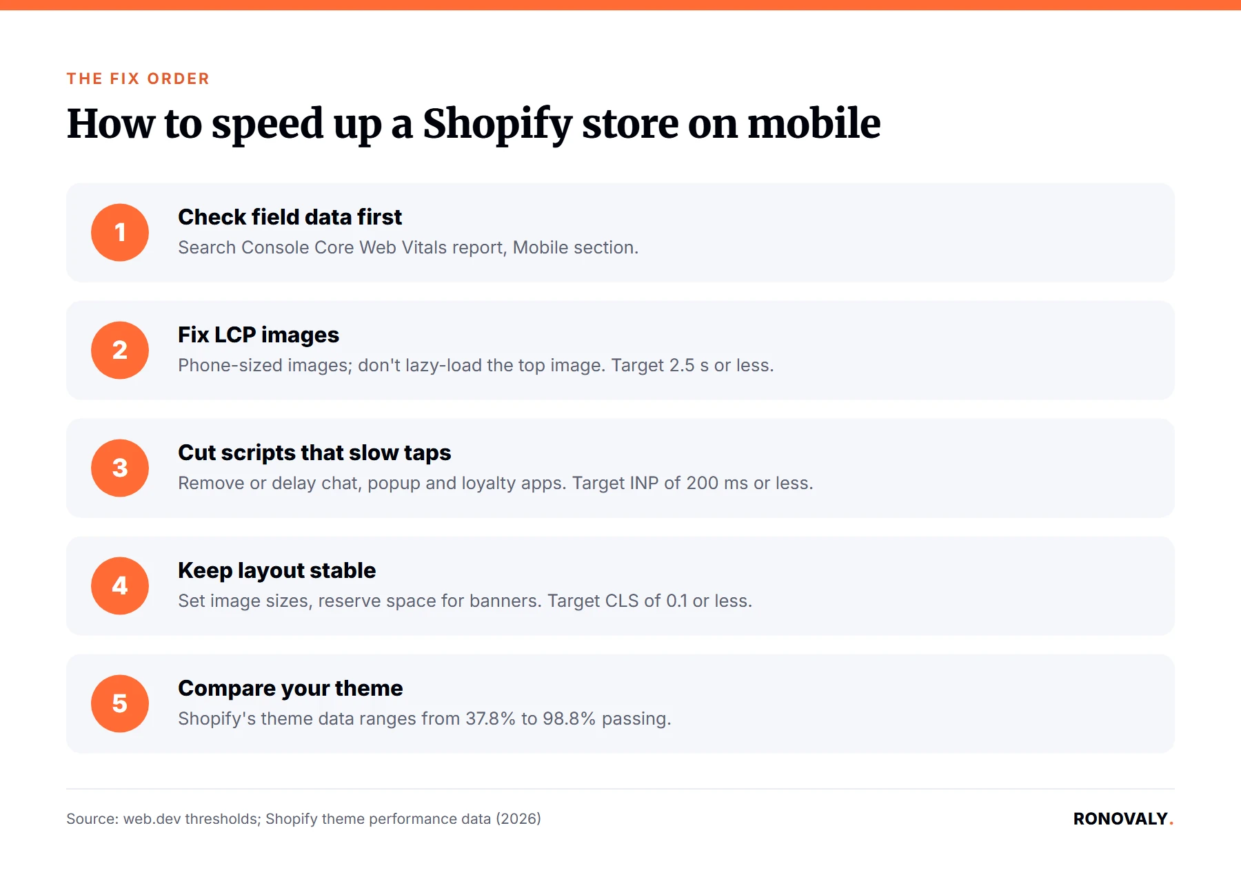
Start with field data from real visitors. Open Google Search Console, go to the Core Web Vitals report, and look at the Mobile section. It groups your URLs into good, needs improvement, and poor. Then run PageSpeed Insights on your top product and collection pages, and read the field data section at the top before the lab score below it.
Use the lab score as a guide, not a verdict. Lighthouse rates 90 to 100 as good, 50 to 89 as needing improvement, and 0 to 49 as poor. However, Google’s ranking signal comes from the field data, measured at the 75th percentile.
Step 2: Fix LCP With Smaller, Earlier Images
LCP is usually your hero image on the homepage and the main product photo on product pages. To bring it under 2.5 seconds on mobile:
- Serve images sized for phone screens instead of full desktop widths; many Shopify themes handle this through their image settings.
- Don’t lazy-load the main image at the top of the page, since that delays the element LCP measures.
- Remove sliders and autoplay video from the first screen on mobile, where one image does the same job.
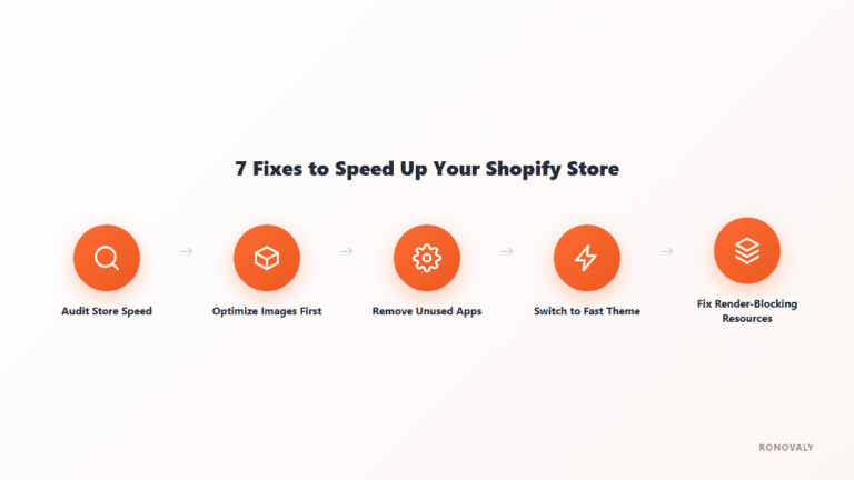
For a deeper image and theme checklist, see our seven Shopify speed fixes.
Step 3: Cut Scripts That Slow Down Taps
INP passes on 90% of Shopify sites on mobile, but that still leaves one in ten stores failing it. A common cause is third-party JavaScript running when a visitor taps “Add to cart” or opens a menu. Chat widgets, popups, and review or loyalty apps are common examples.
List every app that loads on your product page, then remove or delay the ones you don’t need on first view. Our guide to removing unused Shopify apps covers the full cleanup. Apps you uninstall can also leave code behind, so check your theme files afterward.
Step 4: Keep the Layout Stable
CLS passes on 92% of Shopify sites on mobile, so it’s rarely the first fix. Still, check three causes if your report flags it: images without width and height set, banners or announcement bars injected after the page loads, and sticky headers that appear late. Reserve space for each of them in the theme so nothing jumps under a visitor’s thumb.
Step 5: Compare Your Theme Against Shopify’s Data
Your theme sets your starting point. Shopify’s theme performance table, updated September 22, 2026, shows a median 88.9% Core Web Vitals pass rate across themes on current versions, with a range from 37.8% to 98.8%. If your theme sits near the bottom, image tuning alone may not close the gap. Our speed-tested theme roundup is a starting shortlist.
Common Mistakes to Avoid
- Judging mobile by your own phone on Wi-Fi. Real visitors use slower networks and devices, which is why field data matters.
- Chasing a perfect lab score. A score in the 50 to 89 range can still pass Core Web Vitals in the field; check both.
- Starting with layout fixes. On Shopify mobile, images and scripts fail more often than layout does.
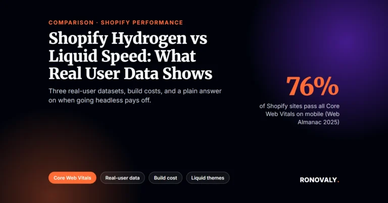
- Rebuilding for speed alone. Going headless is a big project, and real-user data doesn’t show it’s faster on average; see our Hydrogen vs Liquid speed comparison.
Frequently Asked Questions
Why is my Shopify store fast on desktop but slow on mobile?
Phones have slower processors and often slower connections, so the same images and scripts take longer. Real-user data shows the gap: on Shopify, good LCP drops from 92% of sites on desktop to 86% on mobile, and good INP drops from 99% to 90%. Test the Mobile tab and your Search Console mobile report separately.
What’s a good mobile PageSpeed score for a Shopify store?
Lighthouse rates 90 to 100 as good, 50 to 89 as needing improvement, and 0 to 49 as poor. However, the lab score isn’t what Google uses for ranking. Check the field data in PageSpeed Insights or Search Console, where Core Web Vitals are judged at the 75th percentile of real mobile visits.
What are the Core Web Vitals thresholds for mobile?
Google’s good thresholds are the same on mobile and desktop: LCP within 2.5 seconds, INP of 200 milliseconds or less, and CLS of 0.1 or less. They’re measured at the 75th percentile of page loads, and mobile and desktop are assessed separately.
What should I fix first to speed up a Shopify store on mobile?
Start with LCP, usually the hero or main product image, because it’s the metric Shopify sites miss most on mobile: 86% pass, versus 90% for INP and 92% for CLS. Serve phone-sized images and don’t lazy-load the top image. Then remove or delay heavy third-party scripts.
Does my Shopify theme affect mobile speed?
Yes. Shopify’s own theme data shows Core Web Vitals pass rates ranging from 37.8% to 98.8% across themes, with a median of 88.9% on current versions. If your theme is near the bottom of that range, switching themes may help more than tuning individual images or apps.
Next Steps
Open your Search Console Core Web Vitals report today and note which mobile metric fails most. If it’s LCP, start with your top five product pages’ main images. Recheck the report after 28 days, since field data updates on a rolling window.
About the Author
Alex Carter covers AI, automation, and Shopify performance for Ronovaly, focusing on changes that move real-user speed for stores in the $500K to $5M ARR range. Editorial note: this guide was rebuilt on September 27, 2026; every figure was fact-checked against its source that day.
Sources
- HTTP Archive, Web Almanac 2025, Ecommerce chapter (2026): https://almanac.httparchive.org/en/2025/ecommerce
- web.dev, Web Vitals: https://web.dev/articles/vitals
- Chrome for Developers, Lighthouse performance scoring: https://developer.chrome.com/docs/lighthouse/performance/performance-scoring
- Shopify, Theme performance data table (updated 2026-09-22): https://performance.shopify.com/pages/theme-performance-data-table
This post contains affiliate links. If you make a purchase through these links, we may earn a commission at no extra cost to you.